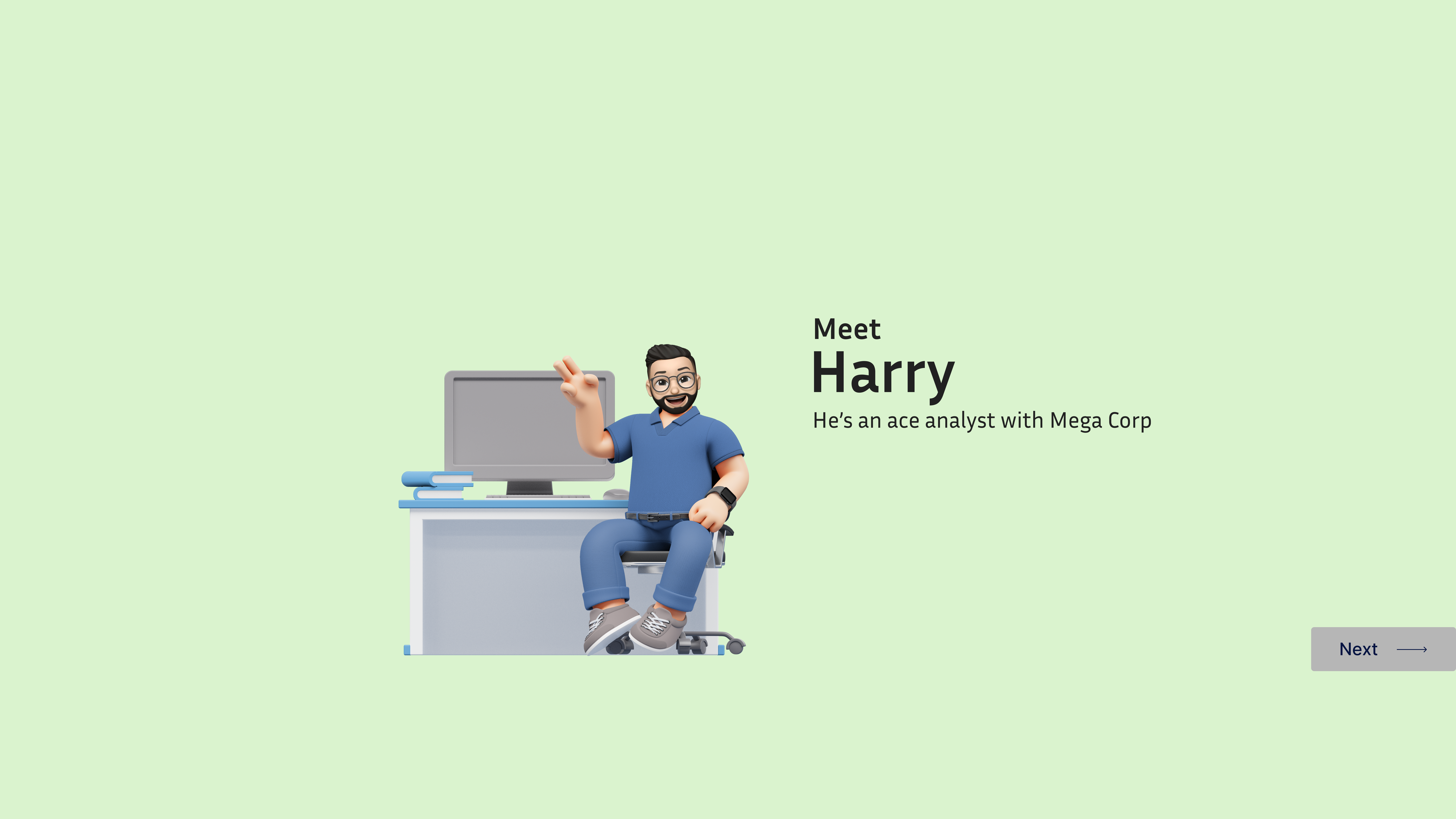
AI-generated 3D characters looked uncanny and inconsistent across the security storytelling system.
Established a reusable 3D character system adopted across all Netenrich narrative content.
Lead UX Designer — character system design, narrative methodology, prototyping.
Consistency beats perfection. A coherent system outlasts any single great asset.
A spec document describes what a product does. A story makes someone feel why it matters. Those are not the same thing — and for most cross-functional audiences, only one of them works.
For the Chronicle CMS — Detection Rules & Packs project at Netenrich, traditional documentation wasn't working. Complex security concepts like detection rules, content packs, and low-code tooling needed a different communication approach.
The team needed a way to explain these ideas that was accessible to technical and non-technical audiences alike. Specification documents and slide decks were being ignored. A new method was needed.
The team had detailed specification documents. They had slide decks. They had a wiki. None of it was being used at the moment it mattered most: when a salesperson was explaining the platform to a prospect, when a new team member was trying to understand why content packs existed, when a non-technical stakeholder needed to make a decision.
The problem wasn't the information. It was the format. Specifications are written for people who already understand the domain. When the audience is mixed — part technical, part business, part brand new — the format breaks down. People skim, get lost, stop caring.
The ask came from a sales leader who said something that reframed the project:
"I can demo the product. I can't make someone feel why it's different from everything else they've already tried." — Sales lead, project kick-off
The approach was a comic-style narrative featuring two characters: "Harry" — a confused but capable SOC analyst drowning in alerts, and "John" — a Netenrich security expert who guides him through the platform.
The story walks through real product scenarios, making abstract security ideas concrete. Instead of listing features, the narrative shows problems being solved in context — from the analyst's perspective.
25 slides, two characters, one product story. Browse 8 curated moments that each demonstrate a specific storytelling technique. Use ← → arrow keys or the buttons to navigate.
Introduce the pain before presenting the solution. Let the audience feel why existing approaches were failing.
Concepts like detection rules, content packs, low-code tooling, and Gen AI needed to be easy to understand at first read.
Provide sales, design, and support teams with a single story they could all reference and align around.
The narrative is structured as a classic five-act arc. Each act introduces one or two product capabilities — but only after the audience understands the problem those features solve.
Harry discovers an APT-30 attack, stops it — but then finds it spreading. The pain is felt before any solution is offered. The audience identifies with Harry before the product is mentioned once.
John from Netenrich is introduced as a trusted expert, not a salesperson. The character contrast (stressed analyst vs. calm expert) creates a mentor-student dynamic that makes every feature explanation feel organic.
Detection Rules are introduced through Harry's questions, not feature specs. The MITRE ATT&CK framework, version management, and collaboration features are each revealed as answers to Harry's natural curiosity.
Content Packs, tagging, publishing, and update flows are shown as the system that makes rules manageable at scale. Harry progresses from understanding individual rules to managing a full library.
Three methods for rule creation are introduced in ascending order of impressiveness — low-code form, raw code, then Gen AI. Harry's escalating enthusiasm mirrors the natural "wow" progression of a product demo.
The story closes with Harry thanking John — not with a feature checklist or a "Get Started" button. The narrative ends on a human note, leaving the reader with emotional recall rather than information overload.
Characters before features. The story opens with Harry's problem — an APT-30 attack spreading through databases — before Netenrich is even mentioned. Traditional product documentation starts with the product. This starts with the pain. That sequencing is deliberate: the audience needs to care before they'll listen.
3D avatars instead of illustrated icons. The characters are fully rendered 3D figures, not simple icons or sketches. This was a conscious choice to increase perceived humanity. A 3D character with body language, expression, and pose carries far more emotional weight than a flat avatar.
Product UI screenshots embedded within scenes. Rather than placing UI screenshots in their own "product demo" section, they're woven into the dialogue panels — appearing as John explains a feature to Harry. This means the UI is always shown in the context of a use case, never in isolation.
Feature reveals in ascending order of impressiveness. Low-code comes before code, which comes before Generative AI. This isn't accidental — it follows the structure of a good pitch: accessible capability first, then depth, then the closer. The audience is primed to be impressed by Gen AI because they already understand the baseline.
Interactive "View Prototype" links embedded mid-narrative. The story doesn't wait until the end to offer a prototype. Two mid-story touchpoints let engaged readers jump in at the moment of peak interest. This mirrors the sales principle of meeting a buyer when their intent is highest.
Midway through production, the 3D characters were challenged internally. Rendering time was high. The style felt "too polished" for internal documentation. A version was produced with simple illustrated icon-style characters — faster to make, easier to update, cheaper to maintain.
I pushed to keep the 3D characters. The argument was simple: flat icons don't have body language. Harry's slumped posture when overwhelmed, John's confident stance when explaining, the subtle physical acting in each panel — these carry meaning that flat vectors can't. The emotional resonance of the narrative depends on the audience believing these are people, not placeholders.
The production overhead was real. The impact difference was also real. When we shared early versions with internal stakeholders, the feedback on the 3D version consistently included words like "engaging," "memorable," and "I actually read the whole thing." The icon version got: "clear."
"Clear" is not the same as "compelling." For documentation, clear is enough. For a story that has to make someone care, compelling is the only metric that matters.
Increased efficiency in onboarding and training — new team members grasped core concepts significantly faster.
Cross-functional teams responded enthusiastically. The narrative format resonated with technical and non-technical audiences alike.
Growing user base for the narrative format — other teams began requesting similar storytelling assets for their products.
One of the most effective tools for team alignment and concept clarity across the organization.